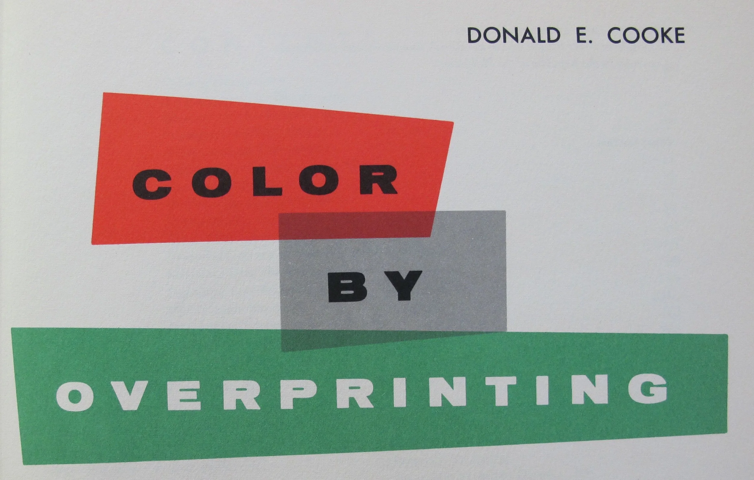
Color by Overprinting


Published in 1955, Donald E. Cook’s Color By Overprinting is a complete guidebook in the art of overprinting spot color (line art) inks in multiple combinations. Most offset litho and letterpress printing inks are transparent in quality. One transparent color overprinted onto another transparent color produces secondary hues where the two colors overlap. This is the essence of color by overprinting.
The book certainly does accomplish the goal of creating science out of guess work and is a useful and meticulously organized print tool. It allows printers to preview the overprint characteristics of colors before even inking up, and gives designers working in spot color a real life print specimen in which to gauge overprint effects. Even today, this simply can’t be done digitally. The book features eleven basic colors from which, when grouped in various combinations of tricolor sets, produce hundreds of secondary colors. Color By Overprinting is organized in an index of colors of warm, intermediate, and cool color groups. Page by page, each color group is demonstrated with overprints of all possible combinations of the eleven basic colors.
It is interesting that for such an exacting work, the writer introduces a bit of whimsy by challenging the prevailing norm (in 1955) of commercial print and the role of the printer. Cooke himself was an artist and illustrator as well as a disciplined technician. He makes the point that print technology had evolved so far by that point that it had been removed from the field of art entirely. He presents a counterpoint by stating that the printing press itself should be regarded as an artist’s tool, not just a reproduction machine. There is considerable machinery between and artist and the press sheet, yet fundamentally, it is no different from using a brush, pen, or pencil.
Between the artist and his or her paper or canvas there is always a tool of some sort. Cooke writes, “If we have made mistakes, with all our miraculous inventions, perhaps the greatest has been a preoccupation with facsimile reproduction. In effort to match, down to the most subtle shade… color printing has channeled itself down a dead end alley. Too many printers, engravers, and artists have lost sight of the simple fact that what pleases the eye may not please the soul of the technician, or vice versa.”
Color By Overprinting itself is an incredible example of mid-century print work. All colors featured in illustrations and color swatches are actual spot colors, not the less expensive to produce process color. Typographical composition is done by Linotype and repro proof, as well as Intertype cold type. It is truly a beautiful printed piece, but also an incredible tool for fans and printers of real ink and spot color.
